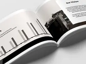
Whether you’re printing a high-end brochure, an architectural plan, or custom packaging, nothing is more frustrating than a print job that doesn’t match your expectations. At Paza Creative Studio, we’ve mastered the art of getting every single print right — the first time.
In this post, we’re breaking down our tried-and-true process so that you can achieve flawless results, every single time.
🎯 1. Start with the Right File Format
The perfect print begins long before ink hits paper. Make sure your design files are:
In CMYK color mode (not RGB)
Set at 300 DPI resolution
Sized exactly to the final print dimensions
Saved as PDF, TIFF, or EPS (avoid JPGs for critical prints)
Pro tip: Always include 3mm bleed on all sides — this prevents unwanted white edges after trimming.
🖌️ 2. Use Vector Graphics for Sharp Results
Logos, icons, and any text-heavy content should always be created in vector format. This ensures:
Crisp lines at any size
Scalable design with no pixelation
Lightweight, printer-friendly files
Tools like Adobe Illustrator are ideal for this. If you’re working in Photoshop, stick to smart objects and avoid rasterizing too early.
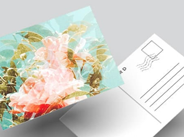
🎨 3. Choose Colors Wisely
What looks good on screen may not print well. Here’s how to avoid color disasters:
Use Pantone Matching System (PMS) colors for brand consistency
Avoid overly saturated or neon colors — they rarely print as expected
Request a printed proof or color sample before the final run
📐 4. Pay Attention to Typography
Fonts that look beautiful on screen can sometimes get lost in print. To avoid that:
Don’t go below 6pt for body text
Convert all text to outlines/paths before sending the final file
Use high-contrast text/background combinations for legibility
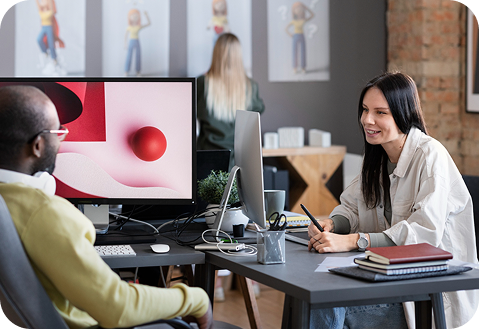
🧪 5. Always Run a Test Print
A test print saves time, money, and headaches. It helps you spot:
Alignment issues
Unexpected color shifts
Resolution or scaling problems